|
|
Post by Brian Wynn on Oct 20, 2009 2:04:12 GMT -5
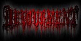
 Our New logo from Mike Majewski of Devourment, Were looking for new concepts for a MESHIHA logo, If you have an idea or want to send us something. We want a nasty but legible logo thats symetrical and shaped cool! |
|
Psybergirl
New Member
 Hell Hath No Dominion
Posts: 3
|
Post by Psybergirl on Oct 20, 2009 12:52:03 GMT -5
Love this logo- can't wait to see other options. This one is great...Brutal, yet Legible.
|
|
|
|
Post by Brian Wynn on Oct 22, 2009 23:24:40 GMT -5
Love this logo- can't wait to see other options. This one is great...Brutal, yet Legible. Yeah, Mikes best logo work to date! IMO! I got a logo from Hound in the mail, can't wait to get it posted! |
|
sarfraz
New Member
Slam after Slam after Slam, the best thing that can happen.
Posts: 28
|
Post by sarfraz on Oct 25, 2009 0:17:01 GMT -5
Love this logo- can't wait to see other options. This one is great...Brutal, yet Legible. Yeah, Mikes best logo work to date! IMO! I got a logo from Hound in the mail, can't wait to get it posted! Post the one that Hound sent you, something tells me that his logo is gonna beat all Jewski logos. |
|
|
|
Post by Brian Wynn on Oct 25, 2009 20:12:10 GMT -5
Yeah, Mikes best logo work to date! IMO! I got a logo from Hound in the mail, can't wait to get it posted! Post the one that Hound sent you, something tells me that his logo is gonna beat all Jewski logos. I got Hound's logo in the mail he emailed the first version but the file quality was low. I'm gonna start working on scanning it into the computer tomorrow and adding effects etc! Hopefully I'll have it ready tomorrow! Honestly, I don't know which concept is better Hounds or Majewski's there both kick ASS logo's! I'll get it posted ASAP!!! |
|
|
|
Post by indarkpurity on Oct 26, 2009 1:50:10 GMT -5
I agree that this is Mike's best logo. I've always loved Hound's logos so I'm really interested to see what he came up with for Meshiha. Needless to say, the Devourment logo is the best one for me. I like his savage style like the text "Butcher The Weak" on the back print of old Devourment shirts.
|
|
|
|
Post by sethyr on Oct 26, 2009 12:37:26 GMT -5
the logo is cool for me, keep it that way.
ps: wohoo exalt and smite ;D
|
|
|
|
Post by bd138bd on Oct 26, 2009 12:52:49 GMT -5
Can't see any other logo bettering mike's version. Am curious to see what hound comes up with, though.
|
|
vermiculosis
New Member
sickness hate and pure fucking brutality
Posts: 3
|
Post by vermiculosis on Oct 26, 2009 16:21:35 GMT -5
Imo this logo is pretty nice but not so amazing. Its a bit like BM logos for me hehe  anyway music is most important  |
|
|
|
Post by Brad Fincher on Oct 27, 2009 22:05:28 GMT -5
Mike's logo really is working for us at the moment. He did a killer job. It's a little more "death metal" style-wise than the first one, but maintains legibility, a cohesive shape and decrepit vibe at the same time. The first one is still cool though for the simple fact it's not a typical death metal logo. I saw an early draft of Hound's logo and that's got some really cool ideas going on too! If anyone knows some artists that want to take a shot at a MESHIHA logo we'd love to see them!
|
|
|
|
Post by Brian Wynn on Oct 28, 2009 15:27:16 GMT -5
Here ina few hours I'm going to start working on getting the HOUND logo ready to post! if all goes well it will be posted later this evening! ;D can't wait!!!! check back when ya'll get a chance later!! ;D
|
|
|
|
Post by christopsy666 on Oct 28, 2009 16:02:15 GMT -5
looking forward, what logos did hound do sofar?
|
|
|
|
Post by Brian Wynn on Oct 28, 2009 20:40:37 GMT -5
 Here's Hounds logo concept! I added some basic FX to the original black and white copy, I have yet to try some other FX to it but this is a basic idea of what Hound envisioned for us! I need to get my hands on Adobe Photo shop to get some better quality on the FX but this logo is pretty awesome! Between the Jewski and Hound concepts its going to be a tough call! |
|
sarfraz
New Member
Slam after Slam after Slam, the best thing that can happen.
Posts: 28
|
Post by sarfraz on Oct 28, 2009 22:33:22 GMT -5
Here's Hounds logo concept! I added some basic FX to the original black and white copy, I have yet to try some other FX to it but this is a basic idea of what Hound envisioned for us! I need to get my hands on Adobe Photo shop to get some better quality on the FX but this logo is pretty awesome! Between the Jewski and Hound concepts its going to be a tough call! Just one word [glow=red,2,300]“AWESOME”[/glow] This is the logo I want you guys to use for the band. Get rid of that Jewski one. |
|
Bogues
New Member
NegativeOffset.com
Posts: 20
|
Post by Bogues on Oct 28, 2009 23:26:00 GMT -5
Both work well on their own. My personal preference would be the jewski.
|
|


 anyway music is most important